The Importance of a Call-To-Action and 4 Tips To Increase Your Business
It's widely accepted that the first few seconds when a visitor lands on your company website is the most important. Some say it's 2 seconds, and others give a generous 7 seconds, before a typical visitor will decide to leave or stay on your website. Either way, it's not a lot of time to deliver your message. Once your website is generating decent traffic, it's time to look internally at how they interact with your website. Ultimately these visitors will do one of three things;
Leave
Leave and come back later
Leave having purchased/contacted/booked/etc.
Hopefully they'll do one of the latter two, and your chances of that happening will be greatly increased if you follow the tips in this post.
1. Have a clear focus of what you want your visitor to do
Your pages must have focus. What I mean by this can be summed up in a simple question (to ask yourself!):
What do I want everybody, who lands on this page, to do?
You might want every visitor to turn into a sale. Brilliant! First you must check how people get to your high-value/bestsellers:
Is there suitable imagery and links to the product page?
On the product page, is there an 'Add to Cart' or 'Buy Now' button? Is it clear to see?
Once it's in the cart, how do I purchase quickly?
How many steps are there from adding to my cart, to receiving my order receipt?
Do I have to sign up to anything along the way?
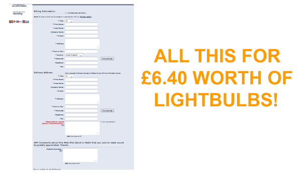
form
The last question there is interesting. Often a checkout process will ask a user to sign up way too early, and this can lead to lots of missed sales, especially if the average order value is low. It usually makes more sense to place the registration part right at the end, when the shopper has filled in their personal details and has 'crossed the line of no return' (or better put, has invested too much time to now stop). It's worth asking someone, who isn't connected to the business, what their opinion is. Afterall, a good button can increase conversions.
Always keep a clear idea of what you want a visitor to do, on any page that they might land on. Your conversion rates will be likely to increase dramatically with a little focus. Although not strictly web-related, Apple Inc. has for years remained the market leader for easing the user through a series of on-screen processes. Steve Jobs' resignation from Apple won't change that, because it's so deeply ingrained in the company, that it's almost become their brand.
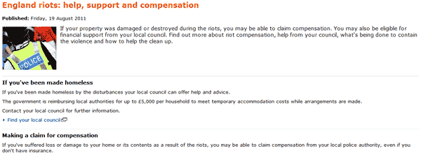
england-riots
Another recent example is the England riots. The Government website, although [in my opinion] a user's nightmare, does clearly set out what someone should do if they have been affected. Whilst not optimum, it does serve a purpose, and it does guide the user somewhat. Their new AlphaGov BETA website is working on improving the usability side of things, through 'revolution' and not 'evolution'. Here is a fantastic article on AlphaGov by usability whiz, Leisa Reichelt.
2. Position your business' phone number clearly
Not everybody wants to spend time reading about how great you or your business is, and more often than not, those are the people who want to pick up the phone. A clearly displayed phone number means that a prospect can land on your website, and be speaking to somebody within a couple of minutes. A favourite place to display your phone number is in the top-right of your website. It's also worth repeating it in the footer, and within content if the page is particularly long.
A second benefit is that a phone number adds credibility to your business. It signifies that you have a 'base' from which to receive calls. With SPAM artists on the increase, it's these touches that will gain you extra sales.
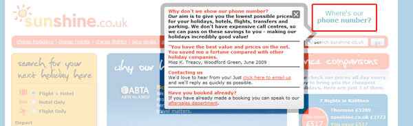
sunshine
If you do NOT have a phone number, for whatever reason, then consider using it to your advantage. Look at how Sunshine.co.uk (above) have turned it into a plus point. They simply state that they're saving you money as a customer. So all the overheads and staff salaries saved quickly become a comforting sign and a benefit to the visitor.
3. Tell your user what YOU want them to do
This is a key part of marketing in any form. If the user has to guess what it is you want them to do, then they might lose interest or become distracted. With so many marketing messages being thrown at us in today's world, it's attention which is being lost. People want things now, and faster than ever before.
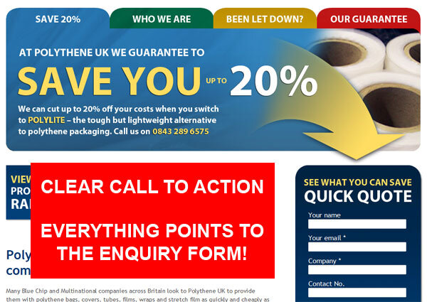
polythene-uk
Whilst you don't want to be too pushy, it's OK to tell your visitors to 'Like' your Facebook Page 'to receive special offers'. It's OK to ask them to 'please take just 2 minutes to fill in our survey'. Your response rate will be notably higher than if you simply have 'our survey' as your link. In the first case, you're asking them to do you a favour, and assuring them that it will only take two minutes. Perfect - I know that I'm not going to be hit with a 3-page open question survey!
Most of the time it's about the visitor. What do they get out of following through on your call-to-action? Remind them of it...
4. Use the 'Fold'
In traditional marketing media, being 'above the fold' has always had an impact on response rates. Take a newspaper, for example, where the main headline needs to have a strong impact in a bid to stand out from other competing papers. A simple Google search for 'newspaper front page' will show you just how competitive it is out there:
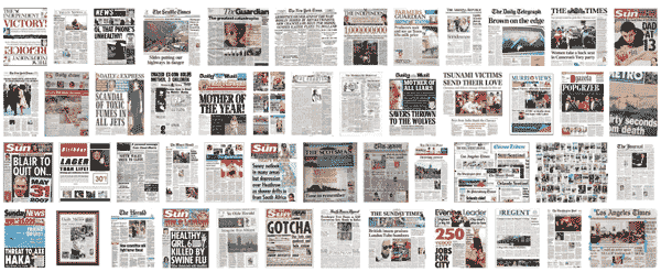
headlines
The clever twisting of words, the bold typeface, and strong imagery - they all contribute towards earning our attention.

ikea
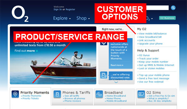
o2
On a website, the situation is the same. You have just a few seconds - estimated between 3-7 seconds - to persuade your visitor to stay. The website must transmit all the usual signals that a customer is looking for; confidence in the product/service, trust in the company, and means of making contact. Depending on your screen resolution, the fold area will differ from one user to another. In that case, it's best to serve the majority (unless your market suggests otherwise - elderly people may use smaller resolutions to increase the size of contents on their screen).
Strong imagery (animated images are popular and can deliver multiple messages), and text that clearly shows relevance to what the customer is after. This post is still very relevant to designing a good website for the user, and is worth a read. Potential ideas to help build confidence in the visitor:
List your main products or services
Areas you serve
The pains/problems that your business solves
Photos of your staff, office, and vehicles
Awards you've won
Associations; FSB, Chambers of Commerce, etc
What information is your website delivering above the fold? Could you be squeezing some extra conversions by focusing on your websites' call to action?