New Shoes, New Shirt, New Direction
“Is it time to up our own game? We all just look the same” This was the statement during a team meeting that got the ball rolling towards refreshing our brand and designing a new website that reflects our business as it is today.
We had just finished launching a couple of projects and the focus turned to our own brand and external image during a quiet week last Christmas. In summary, we felt it was time to stand out against all the bland and depressingly predictable agency websites. You know the ones... Various types of hardwood, faux foliage, beer fridge.
We've been there, we've got all of that, but that's not us. It was a unanimous decision to position ourselves at a new level and to show off some skills, whilst rigidly following our own process from start to finish.
The content you’ll find below details a few of the things we learned while refreshing our brand and creating our new website.
Before I get into the nitty gritty there are a few things to point out:Firstly, the title of this post contains an in-joke. If you're interested, here is the Kenny Chesney smash we play every Friday at the end of the day, enjoyed with a cold drink and some team bantz, as we each plan the next week ahead and submit our timesheets.
Now on to the post:
Branding and websites are an ever-evolving beast and both require a proper strategy. We built our strategy first.
We had lots of 'stuff' already - values, various types of personas, and countless brain dumps. It had just been lost over a year or two and needed consolidating into something usable.
Although our website is an integral part of our marketing, we are keen to push this using new technology and embracing what digital marketing excels at; reaching audiences at scale.
We have a great team of experts to turn our vision into reality. If you don't have this, why don't you consider hiring us?
Introduction
We’re a group of focused, bright, innovative, and modest professionals with experience in various elements of web design! Meet the team who worked on this project:
Laura Potter - Project Manager
Lloyd Sutton - Front End Digital Designer
Tim Pennells - Creative Designer
Louis Lobban - Technical Executive
Team Zest

Mr Client: Our founder, Alex Minchin (far left)
We decided as a team to sit down and review our marketing strategy. A task which is regularly carried out to ensure that our strategy matches with our wider marketing and business goals. We used exactly the same principles and processes as we use on our client accounts. Practising what we preach was a key decision and consideration for us.
One of the outcomes of this meeting was a decision to focus our efforts on cornerstone blog content, addressing our primary users needs by providing detailed insights into the work we do here. This is to be supplemented by webinars and other forms of knowledge sharing. Events have worked for us in the past, but geographical limitations mean that webinars will enable us to reach more qualified prospects, more frequently, at a reduced cost.
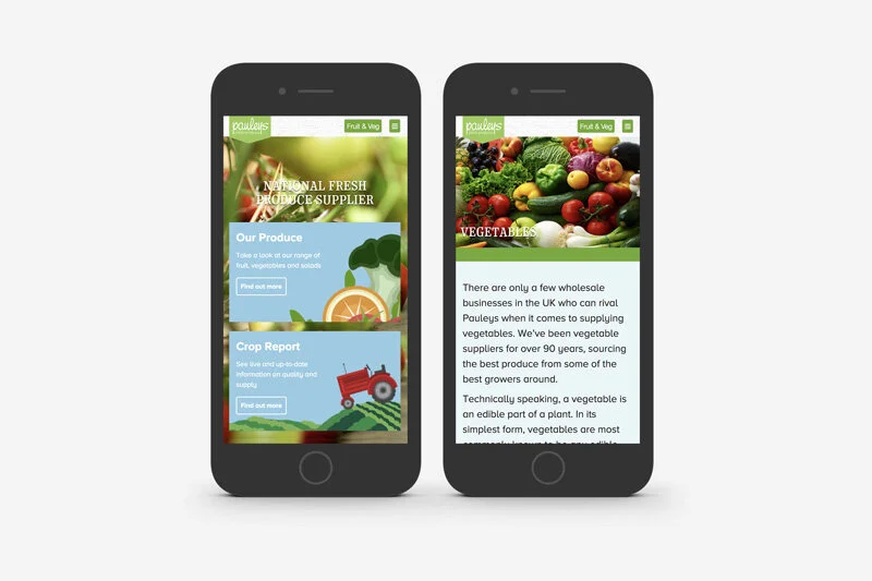
In order to achieve this we needed to review the blog page UX. We improved readability through distilling the blog meta information down, reducing line widths and creating a structured template to allow for dynamic content types.

While the new blog was a big improvement it was still limited by the typography, iconography and imagery across the site.
We’d just scratched the surface in terms of what needed to be done. The project evolved into a much larger redesign, approached in three steps:
Core experience
Brand Identity
Visual Interface
Core Experience
Who are the people who invest in our services? What do they want and need from our website? Looking at our current clients, market, and analytical data, we chiseled out two distinct users:
Graham and Francesca are our two distinct user personas. Which one do you resonate with?

Graham is a decision maker, he's looking to grow revenue and increase margins. He does not have the time or specialist knowledge so is looking for a team with a proven track record who he can rely on to deliver.
Francesca is an in-house Marketing Manager, wanting to partner with a team she can work closely with. She is looking to see if Zest have experience within her sector or have solved similar challenges to hers in the past, and can provide a clear strategic approach alongside excellent account management.
Over time our case studies had been buried too deep for our audience to see them. They were too disconnected from key landing pages such as the homepage and service pages, which was reflected in the analytics data - they weren't getting seen as often as we wanted. Since our case studies offers our prospects proof of our work and reassurance that we're able to deliver excellence, we had to bring these forward in the user's journey.
If we wanted to address this concern we would need to support our homepage, services and insights with detailed, informative and engaging case studies. We created a case study page template which was clearer, highly readable, and could be consistently used across all our projects to provide details on results and processes. Talk is cheap, so we want our work and results to do this for us.

We chose to use a template for mockups and case study images, using flat browser and mobile templates to give the designs context and to present to our client, Alex.
Our templates support our designs providing context while not creating a distraction.
Brand Identity
During our updates of the blog and case study pages, we noted a limitation in the current colour scheme. It didn’t give us many options when it came to sign-posting key content.
Our old colour palette was limiting and didn’t reflect who we are today and where we want to be tomorrow.

Without any secondary colours to support the green and graphite, we were relying too heavily on imagery to bring depth of colour to the pages. Our imagery was often not strong enough to convey the level of quality we wanted to.
The solution? A new direction in colour, and ultimately a brand refresh. We focused on developing a subtle yet strong colour palette which was versatile. We decided to introduce two complementary colours, a cool blue and rich pink. The new colours came with variations, giving us a total range of 12 colours, 4 colours within each hue.
Our new colours give us many more options to create artwork and a depth of colour throughout the website.

Iconography
So we’d decided the photography was missing the mark. But we had further ideas to update our icon set within the new colour guide. Our new icon set was upgraded and disrupted with a ‘jitter’ effect allowing an overlap between the line drawings and the colour fills.
“As an agency with a sometimes complex and diverse service offering, we needed a visual system which succinctly illustrated the various elements of The Zest Way. We originally had an icon set for our services which matched the Zest lime green.
We used these as a basis to distort the illustrations with bold black lines and overlapping fills. We made sure all icons work as .svg files within web environments and more accessible files for the team to use in documentation.” - Tim Pennells, Creative Designer
The result is an expanding set of icons that communicate our services, work, and personality. These can be used across online and offline media, and lift us above the generic imagery too often used by agencies - coffee cups and macs are old news! We have macs gathering dust we've been through so many. And coffee? We have three types.
Our team is everything
We’re not being overly sentimental when we say ‘our team is everything’. It’s just a fact. Without our team we could not deliver the great work we do. Second to this, we pride ourselves on the service we deliver, with dedicated account management and project management as standard, and a specialist team delivering behind it.
Therefore we felt this should be reflected in our marketing and in particular on the website. So we engaged in a new photography session with the whole team shot on a plain white background and desaturated to allow for a classy contrast with our new colour palette.

The outcome was a complete set of uniform photography which can be used in a variety of different situations. Power to the people.
Tone of voice
Zest is growing. We’ve added 5 new lovely people to our team in the past 6 months. This means we all need a hymn sheet to sing from and its got to be consistent. We set up three simple rules to follow so we can all write with confidence about Zest:
Our voice is: Driven by data but easy to understand
Our voice is: Authoritative but helpful
Our voice is: Professional with personality
We now have a shiny new document that the team can use including grammar and punctuation considerations, such as how to use commas properly! Before you judge us...


Are we there yet?
The short answer is no. This was not a ‘our website needs an update’ type conversation. It was completely driven by our requirement to update our marketing strategy and to highlight the work our brilliant team are delivering.
Looking back at our previous websites we can see that things have changed significantly over the last 8 years. Changes in goals, markets, technology, and user needs have all created a need for change. No longer do we want (or have) to prepare for huge updates. Instead, developing new releases as and when we require them for our business will enable us to constantly evolve. We're still the innovative digital marketing agency in Oxford but we've made so much progress over the years.
Our website, like our business, is constantly growing and adapting to both external and internal factors. In fact, your business is probably not too dissimilar. If it is, why don't we have a conversation to see if we can drag you into 2018. Alternatively you can head over to our Growth Calculator to calculate your revenue growth potential and to discover the two key objectives that you need to achieve to send your revenue skywards.
Just like downloading and installing the updates on your iPhone, websites should be maintained and improved in the same vein. As we add new services, capabilities, and continue to invest in our team, we want to make sure that our website and brand reflects this to open up new opportunities today, and beyond.